
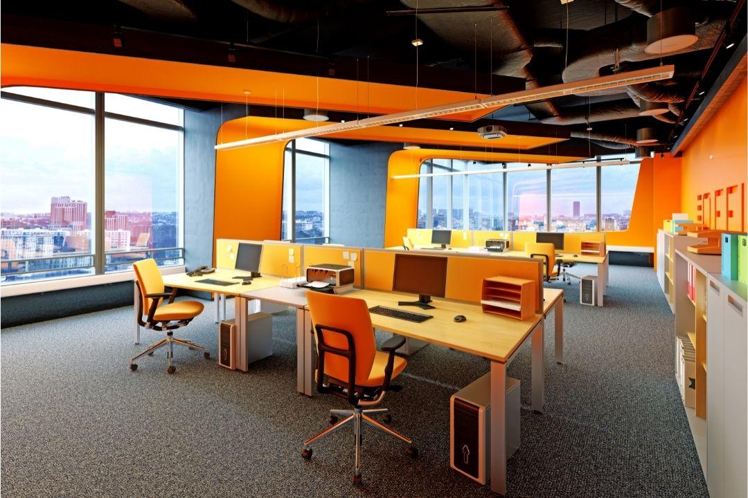
The design of an office has a major impact on how people feel and perform throughout the working day. From lighting and furniture layout to acoustics and temperature, every detail contributes to workplace productivity — and paint colour is no exception. The colours used in an office environment can influence mood, concentration, energy levels, and even communication between employees.
For businesses investing in a workplace refresh, choosing the right office paint colours is about far more than aesthetics. A carefully selected colour palette can help create an environment that supports focus, reduces stress, and encourages efficiency. Whether you manage a corporate office, co-working space, retail headquarters, or creative studio, the right commercial painting strategy can transform the way your team works.


Why Office Colours Matter
Colour psychology has long been used in interior design to influence human behaviour and emotion. Different shades can stimulate creativity, encourage calmness, increase alertness, or create a sense of professionalism.
In office environments, colour choices can affect:
- Employee focus and concentration
- Workplace morale and motivation
- Stress and fatigue levels
- Collaboration and communication
- Client impressions and brand perception
Commercial painters often work with business owners and office managers to develop colour schemes that align with both practical workplace needs and company branding.
Blue: The Ultimate Productivity Colour


Blue is one of the most popular office colours for a reason. It is strongly associated with calmness, stability, and concentration, making it ideal for workplaces where employees spend long hours focusing on detailed tasks.
Lighter blues create a relaxed atmosphere that can reduce stress and mental fatigue, while darker navy tones offer a more professional and sophisticated appearance.
Blue works particularly well in:
- Corporate offices
- Financial firms
- Administrative environments
- Remote working spaces
- Conference rooms
Soft blue-grey shades are especially effective because they balance professionalism with comfort.
Green: Balance and Reduced Eye Strain


Green is another highly effective workplace colour. Because it is commonly associated with nature, balance, and wellbeing, green creates a calming environment that feels less mentally exhausting over long periods.
Green is particularly beneficial in offices where employees spend extended hours in front of computer screens. Softer green tones are gentle on the eyes and may help reduce visual fatigue.
Popular uses for green include:
- Open-plan offices
- Healthcare administration spaces
- Break rooms
- Wellness-focused workplaces
- Shared workspaces
Muted sage and olive tones have become increasingly popular in modern commercial interiors because they create a contemporary yet calming aesthetic.
White and Neutral Tones


White remains a common office colour because it creates a bright, clean, and spacious feel. However, pure white can sometimes feel sterile or uninspiring if overused.
Commercial painters often recommend warmer off-white shades instead, such as:
- Ivory
- Warm beige-white
- Soft cream
- Pale greige
These tones maintain brightness while adding warmth and comfort to the workspace.
Yellow: Energy and Creativity


Yellow is associated with optimism, creativity, and energy. While it can be highly effective in certain office environments, it should usually be used in moderation.
Bright yellow can become overwhelming if used excessively, but softer mustard or muted golden tones can stimulate creativity and positive thinking without causing distraction.
Yellow is often best suited for:
- Creative agencies
- Marketing offices
- Design studios
- Innovation hubs
- Collaborative meeting areas
Grey: Modern and Sophisticated


Grey has become one of the most widely used commercial interior colours in recent years. Modern grey tones create a sleek, professional appearance that works well across many industries.
However, balance is important. Dark or overly cool greys can sometimes create a dull atmosphere if not paired with warmer accents and proper lighting.
To maintain productivity and comfort, many commercial painters recommend:
- Warm greys
- Greige tones
- Light charcoal accents
- Grey combined with wood finishes or greenery
Grey works especially well in modern office environments seeking a minimalist and upscale appearance.
Final Thoughts
The right office paint colours can significantly influence workplace productivity, focus, and employee wellbeing. Whether your goal is to create a calm corporate environment, an energetic creative workspace, or a modern professional office, colour selection plays a major role in shaping how people feel and perform.
By working with experienced commercial painters and choosing colours strategically, businesses can create office environments that not only look impressive but also actively support better work performance every day.