
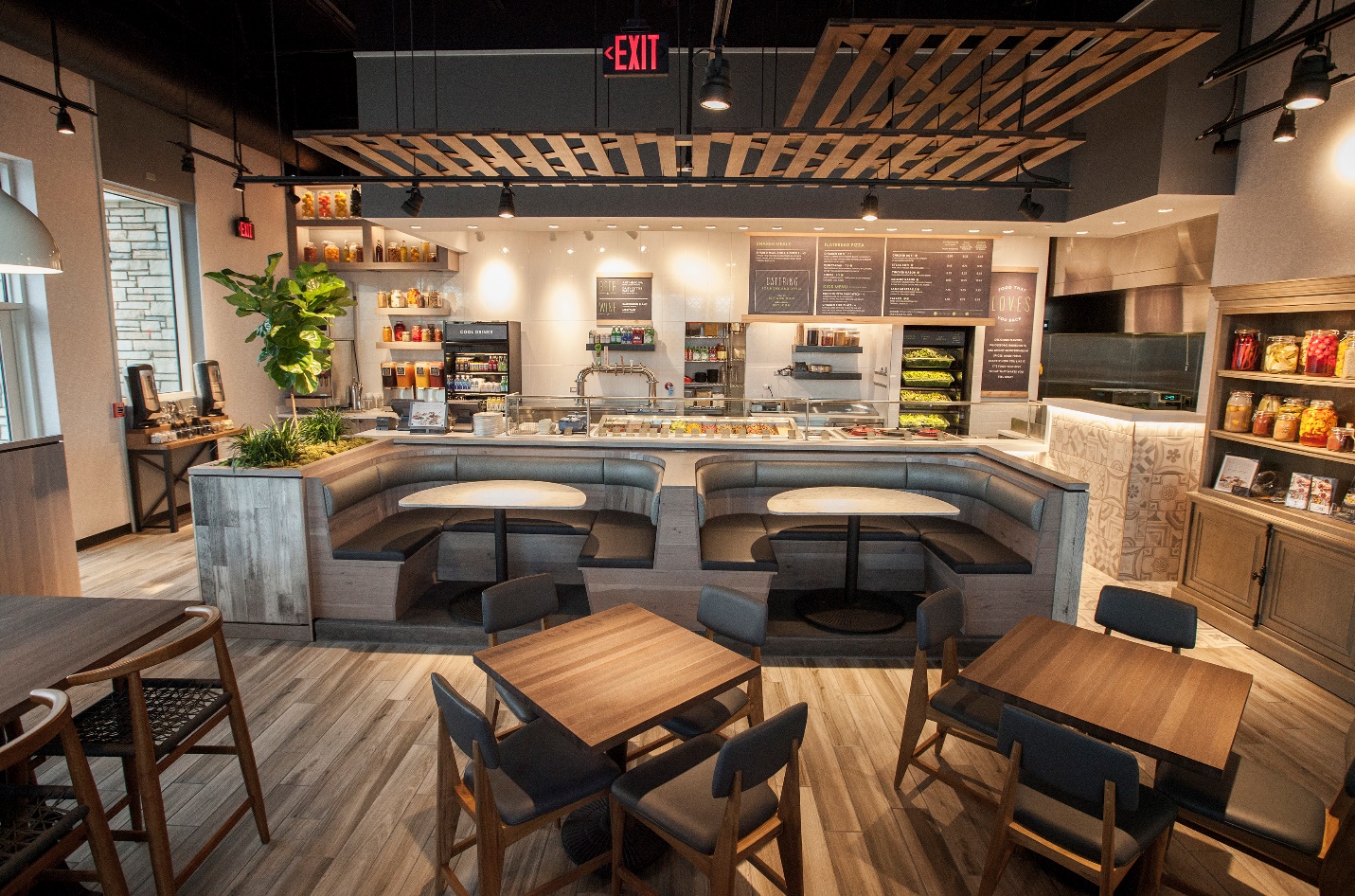
Walk into any successful food business, and you will notice something before you even look at the menu.
The colours.
They set the mood. They influence appetite. They even affect how long people stay and how much they spend.
Get them right, and your space feels busy, warm and inviting. Get them wrong, and people feel uncomfortable without knowing why.
Let’s take a look at what colours work for a food business.
Why Colour Matters More Than You Think
Colour is not just decoration when it comes to food; it is also silent persuasion!
- Warm tones can make people feel hungry.
- Cool tones calm people down.
- Dark tones can feel premium.
- Bright tones feel fast and energetic.
If you run a café, restaurant or takeaway, your colour choices are part of your sales strategy.
Red – The Appetite Trigger

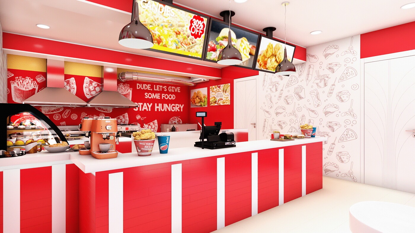
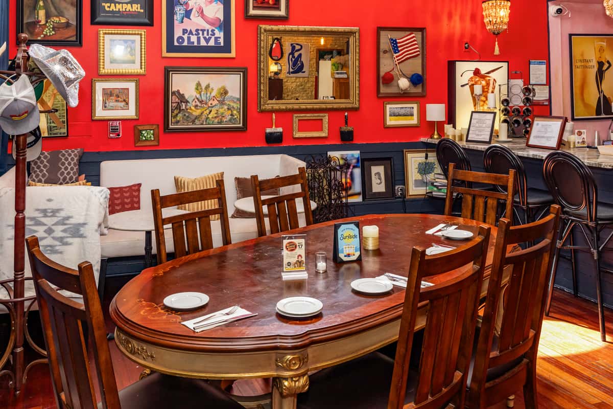
Red is one of the most powerful colours in the food world. It increases heart rate. It creates urgency. It makes people feel hungry.
That is why so many fast food brands use it. Use red if you want:
- High energy
- Quick turnover
- Impulse decisions
But be careful. Too much red can feel overwhelming. It works best as an accent rather than covering every wall.
Yellow – Warm, Friendly and Inviting


Yellow is linked to happiness and warmth. It makes people feel comfortable and welcome. It also goes well with natural light, which is ideal for cafés and brunch spots.
Use yellow if you want:
- A friendly atmosphere
- A casual, relaxed vibe
- A space that feels bright even on dull days
Soft, muted yellows work better than harsh neon tones.
Green – Fresh, Healthy and Natural


Green tells customers one thing instantly. Fresh. It is perfect for businesses focused on:
- Healthy eating
- Vegan or vegetarian food
- Organic or eco-friendly branding
Green also creates a calming environment, which encourages people to stay longer.
Mix it with wood, plants and natural textures for the best effect.
White and Neutrals – Clean and Modern


White, beige and soft greys give a clean and simple look.
They make spaces feel:
- Bigger
- Brighter
- More hygienic
This works well for bakeries, coffee shops and modern dining spaces.
But there is a catch!
Too much white can feel cold. You need to soften it with:
- Wood
- Warm lighting
- Textures like fabric or plants
Black and Dark Tones – Premium and Intimate


Dark colours create a completely different experience.
They feel:
- Sophisticated
- Private
- High-end
Perfect for evening dining, cocktail bars or premium restaurants. Use dark tones if you want customers to slow down, relax and spend more time (and money).
Lighting is crucial when using dark colours, though. Without it, the space can feel gloomy.
Blue – Use With Care


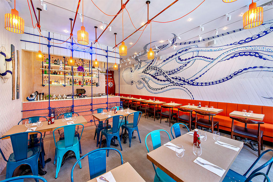
Blue is calming. It is great for offices and bedrooms. But for food businesses, it can reduce appetite.
That does not mean you should avoid it completely.
Use blue for:
- Coastal or seafood themes
- Modern, stylish cafés
- Accent colours rather than main walls
Balance it with warmer tones so the space still feels inviting.
The Smart Way to Choose Your Colours
Before you pick a colour scheme, ask yourself:
- Do I want people to stay or leave quickly?
- Is my brand casual or premium?
- Am I selling comfort food or health-focused meals?
- What feeling do I want when someone walks in?
Your answers should give you a clue to the best colour choices.
No “Best” Colours
There is no single “best” colour. The best colour is the one that matches your brand, your food and the experience you want to create. But if you want a simple formula to start with:
- Warm colours bring people in.
- Natural tones make them stay.
- Dark tones make them spend.
Do You Need Help In Choosing Colours for Your Food Business?
The most successful painting and decorating projects are planned in advance. When you choose us as your painting contractor, you’ll have all your questions answered and help with choosing colours so your project will be completed to your liking.
Contact us today for a free quote.