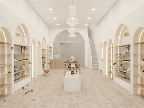
Creating a relaxing salon environment starts with the walls. The right paint colours do more than just look good; they lower stress hormones, regulate the nervous system, and set the tone for a client’s entire experience. In 2026, the trend has shifted away from stark, sterile whites toward warmer, nature-inspired hues that offer “confident comfort.”
Here are the most relaxing paint colours for a modern salon, categorised by the mood they create.
1. Earthy & Grounded Greens
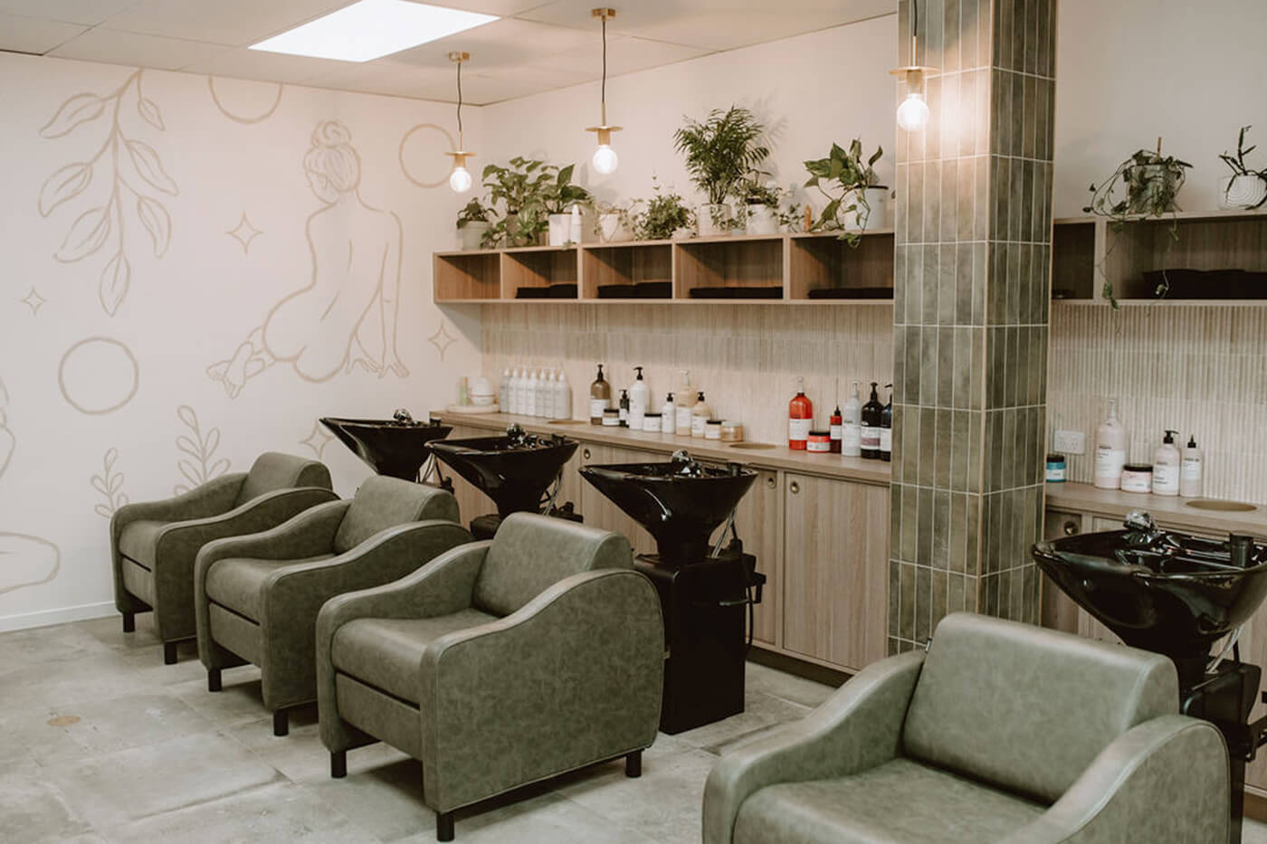
Green is synonymous with renewal and peace, making it a staple for salons.
- Sage Green: Sage green shades bring the outdoors in, creating a restorative, spa-like feel.
- Muted Olive & Moss: Moving into 2026, designers are leaning into richer, yellow-based greens like olive and moss. These colours add depth and soul, especially when paired with natural wood textures.
2. The “New” Neutrals
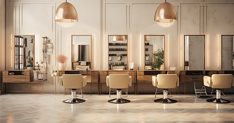
Standard grays are being replaced by warmer, more complex tones that feel “lived-in”.
- Mushroom & Taupe: Mushroom neutrals fall between beige and gray, offering an organic, soulful quality that makes a room look expensive and calm.
- Universal Khaki: Khaki,” is a warm, earthy neutral with green undertones that creates a classic, sophisticated backdrop.
- Warm Off-Whites: Instead of clinical whites, choose airy tones which provide weightlessness without the coldness.
3. Tranquil Blues & Purples
Cooler tones are known as “visual chill pills,” ideal for high-stress service areas.
- Dusty Blue & Indigo: Smoky navy and indigo shades softened with gray are dominating for their timeless, calming charm.
- Soft Lavender & Lilac: These hues are associated with luxury and indulgence. Muted shades offer a refreshing, playful serenity.
4. Warm, “Quiet” Pinks & Terracotta
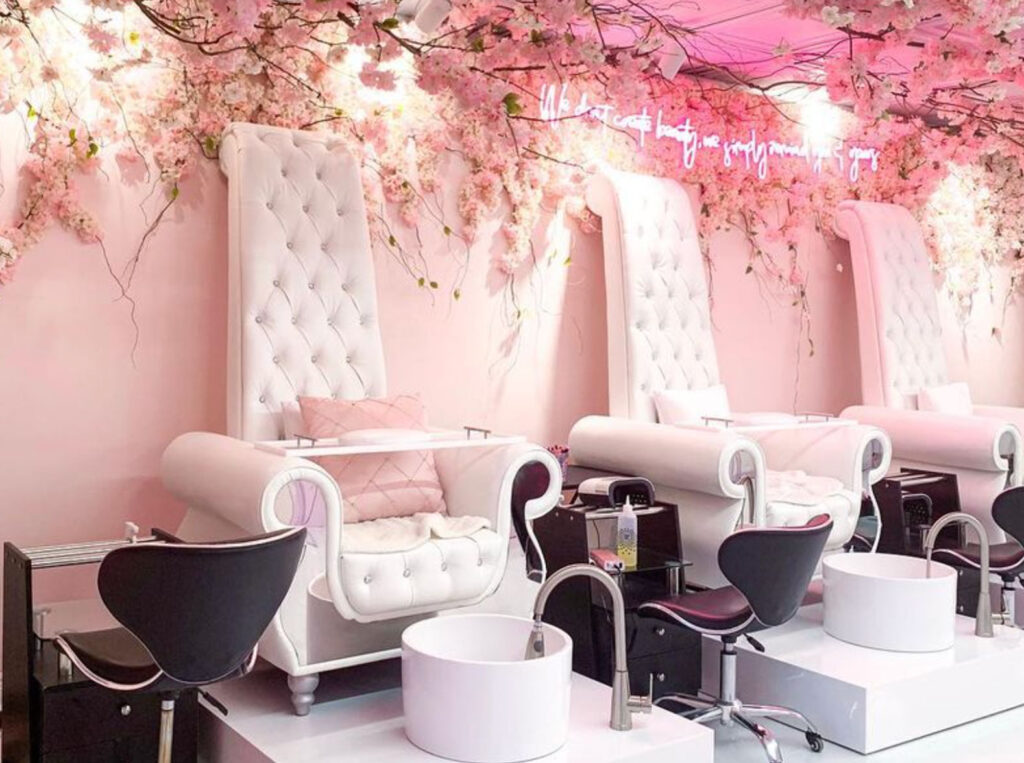
Warm colours can be relaxing if they are muted rather than bright.
- Dusty Rose & Plaster Pink: These earthy pinks provide a “silent therapy” effect, lowering stress levels while making skin tones look radiant in mirrors.
- Soft Terracotta: A sun-baked clay or terracotta tone provides the perfect balance of inviting warmth and grounded Mediterranean energy.
Design Pro-Tips for Salons
- The 60-30-10 Rule: To maintain balance, use a dominant neutral for 60% of the space, a secondary hue for 30%, and an accent color for 10%.
- Test the Light: Salon lighting is critical. Always test paint swatches under your specific artificial lighting, as cool bulbs can make warm colours look muddy.
- Colour Drenching: For a truly immersive experience in treatment rooms, consider “colour drenching”—painting the walls, ceiling, and trim in the same shade to create a cosy, cocooning effect.